About the Project
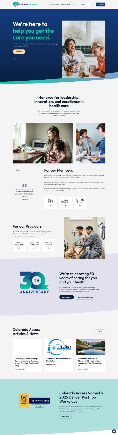
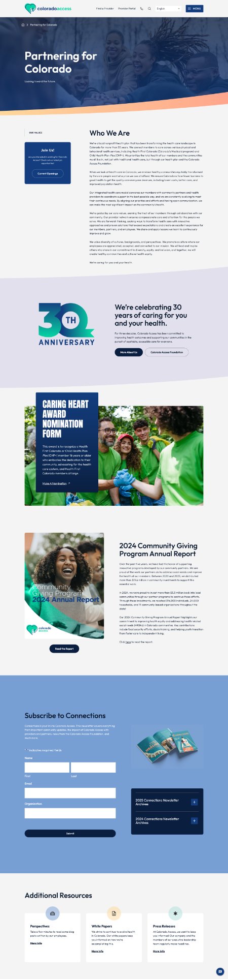
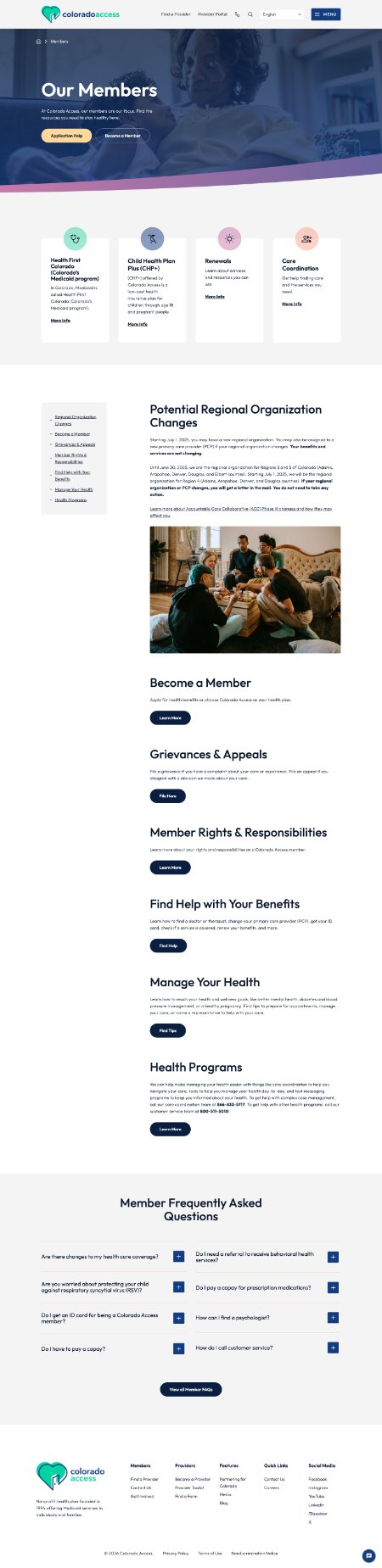
As part of my role at Colorado Access I was one of the leaders who developed the digital strategy and footprint for a refreshed website with a focus on a better UI/UX experience, clearer navigation, and alignment with our internal brand. I worked closely with our off-site full stack developers to user test all aspects of the website as well as ensured the project timeline was adhered to and delivered results we were looking for.
The Challenge
Colorado Access had a website that had spun out of control with nearly 100 pages of various types of content. We had heard from many users that navigating the site was difficult to find pertinent information and that they were searching for a better user experience. Through these conversations we realized there was a gap in how users found information on our website.
The Solution
By building a revamped website that focused on better incorporating the brand, internal voice, a simplified navigation, and a better search utility we gave users the power they needed to be able to find whatever they may be looking for on the website. We received lots of positive feedback and a decline in users requesting help in finding resources or feeling that our site was outdated.